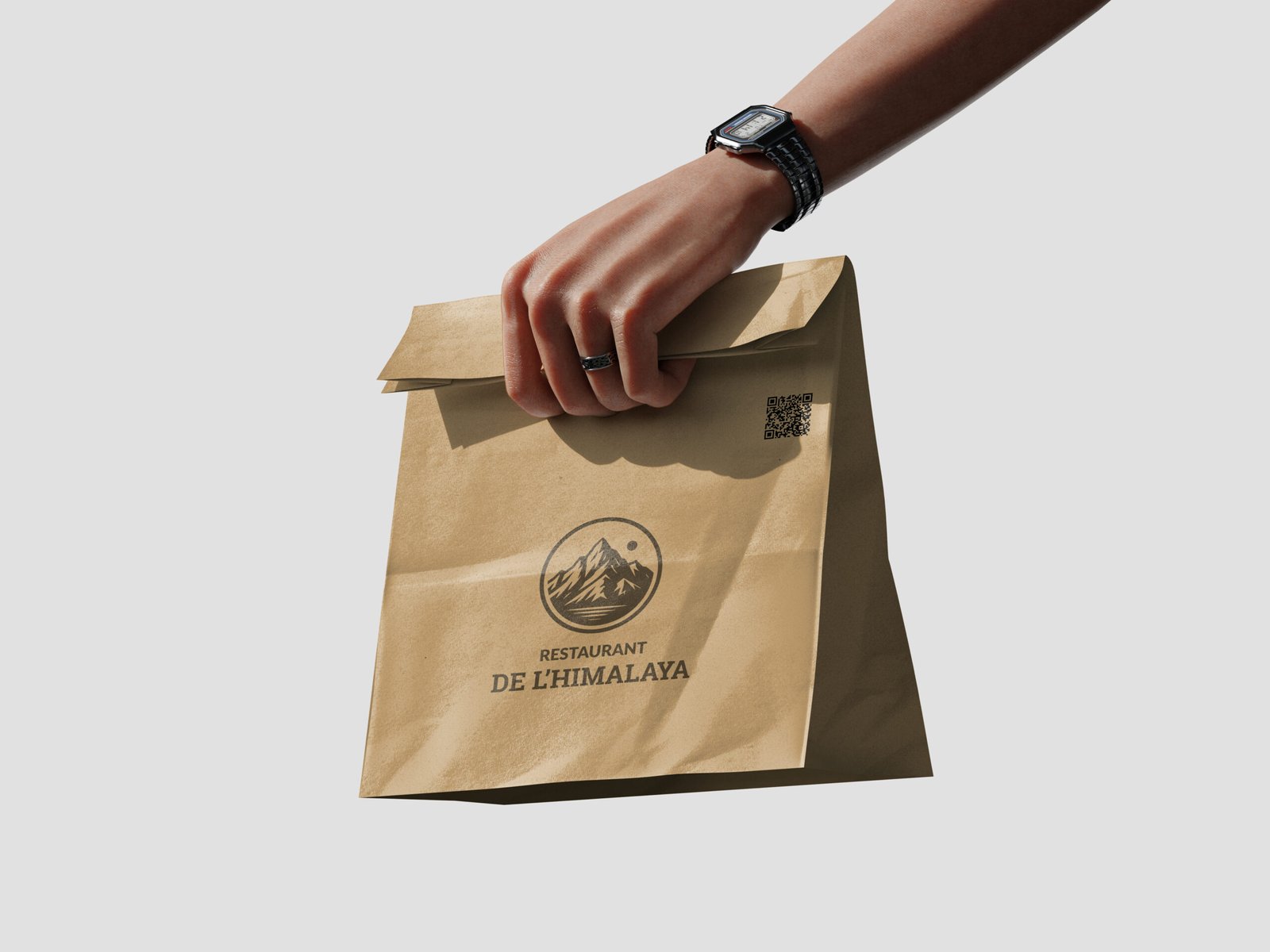
De L’Himalaya is a Himalayan restaurant based in Marseille, launched with the ambition of introducing authentic Tibetan and Nepali flavours to a local French audience.
Context
The founders wanted a brand that felt unique and culturally grounded, not a generic restaurant template. The identity needed to reflect Himalayan roots while remaining clear, approachable, and easy to understand for the people of Marseille.
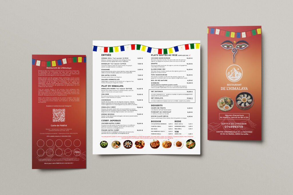
I was responsible for developing the logo and a complete print system, including a folded takeaway menu with integrated loyalty programme and an A4 dine-in menu. The project combined branding, structure, and operational thinking to support their launch phase.
Details
Time Frame:
4-6 Weeks
Project Type:
Brand Identity & Menu Design
Location:
Marseille, France
Collaboration:
Remote
Involvement:
Branding & Print Design
Overview
The project began during the restaurant’s pre-opening stage. The menu was still evolving, dishes were being finalised, and pricing structures were changing. There was no fixed hierarchy or categorisation in place.
The target audience was broad. The restaurant primarily aimed to attract older local customers who value clarity, readable layouts, and traditional dining experiences. At the same time, they wanted to engage younger customers to increase takeaway orders and social visibility.
Challenge
The restaurant was still finalising dishes and pricing during the design phase, which led to multiple revisions and structural changes. The brand needed to reflect Tibetan and Nepali heritage without overwhelming or confusing a Marseille audience.
It also had to serve two demographics at once. Older customers required clarity and readability, while younger audiences needed modern engagement tools such as QR access and loyalty incentives.
All functional elements including contact details, opening hours, and the loyalty system had to be integrated without overcrowding the layout.
Solution
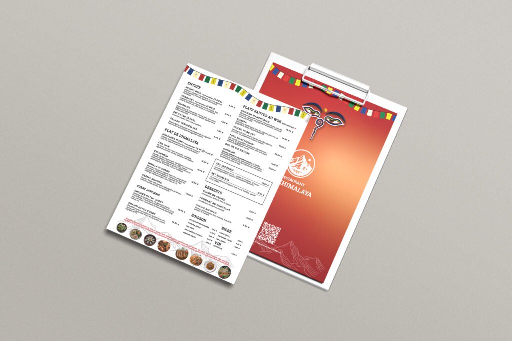
Using my experience in a Pan-Asian restaurant environment, I reorganised the menu into clear categories with logical dish flow. I refined naming consistency and pricing alignment to improve readability and ordering clarity.
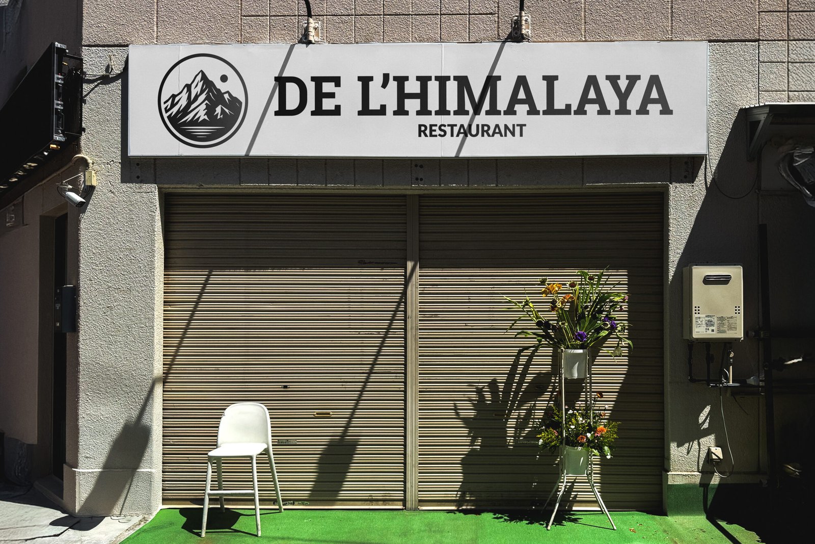
The logo evolved from an initial mountain-and-bowl concept to a simplified circular mountain emblem. This direction was cleaner, more scalable, and easier to reproduce across print materials.
Larger section headers and clear price positioning support older customers. The folded takeaway format, Instagram QR code, and integrated 9-stamp loyalty system support younger audiences and repeat orders.
Instead of a separate loyalty card, the stamp grid was integrated directly into the takeaway menu. This reduces loss, increases visibility, and supports customer return behaviour.
Results
The final outcome delivered more than a visual identity. It gave De L’Himalaya a structured brand foundation at launch, with a distinctive and scalable logo that reflects Himalayan heritage while working consistently across dine-in and takeaway formats.
The evolving menu was transformed into a clear, organised system with improved readability and aligned pricing. QR integration increased social visibility, and the embedded loyalty stamp system supports repeat takeaway orders, balancing cultural authenticity with accessibility for both older and younger customers.
